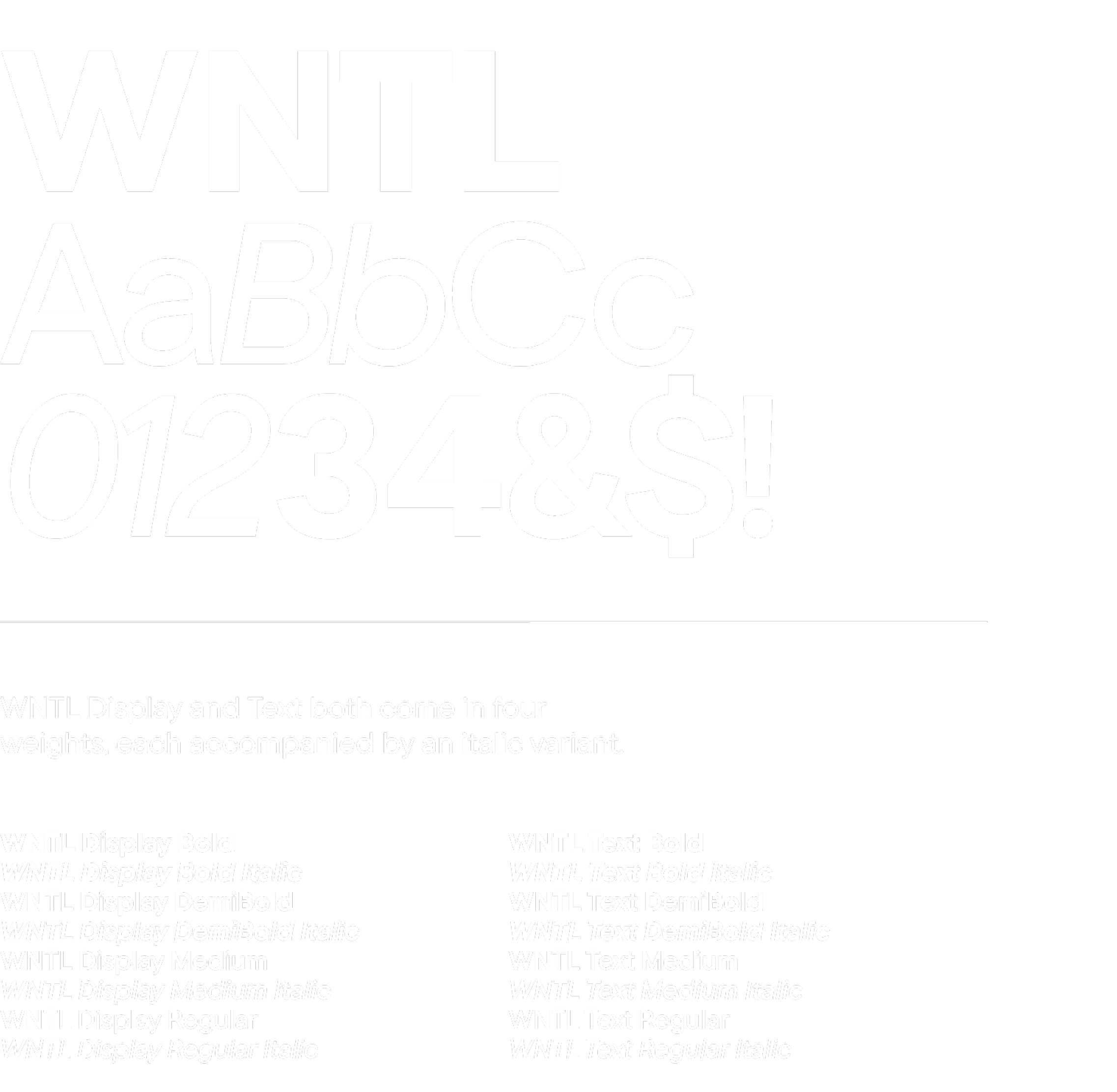
Our typography is designed to give us clarity, boldness, and simplicity.
Our friendly, functional sans serif that’s been designed for button, billboard, and more.
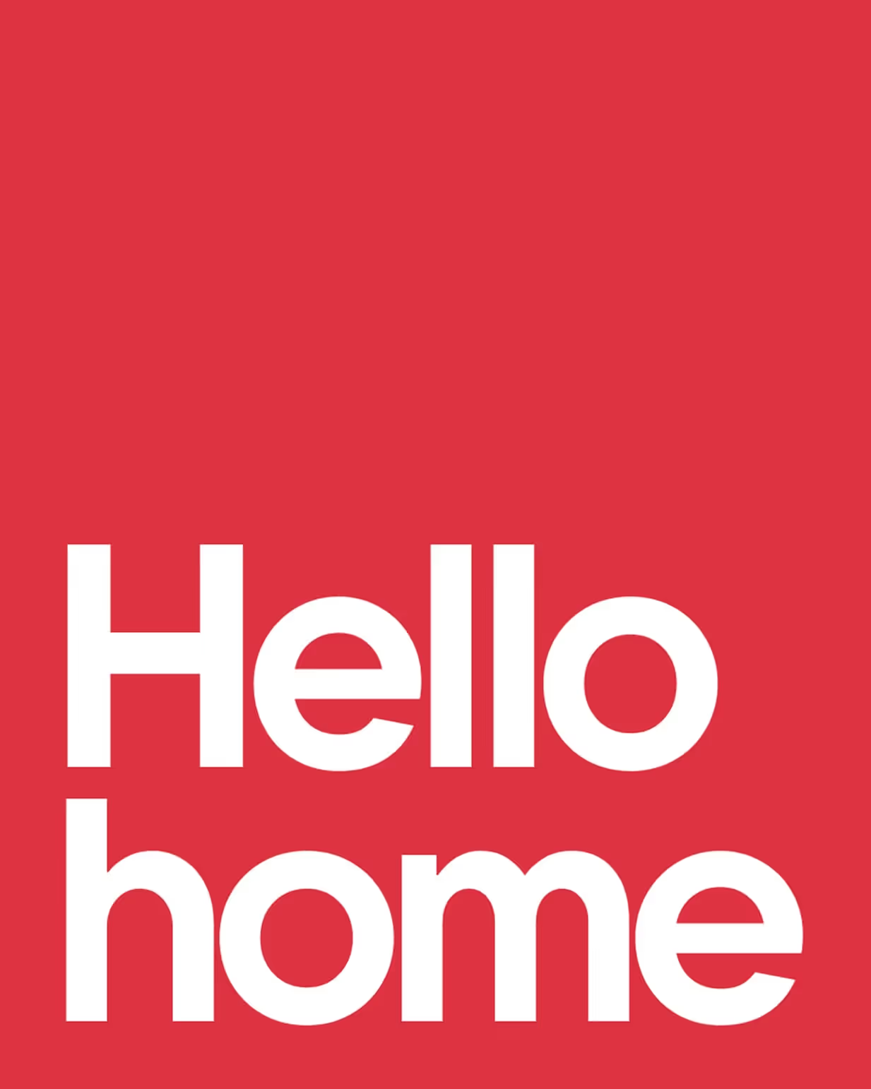
Expression with purpose.
Crafted for trust and clarity, our sans serif unites rational design with a human touch, delivering consistent expression across products, platforms, and posters.
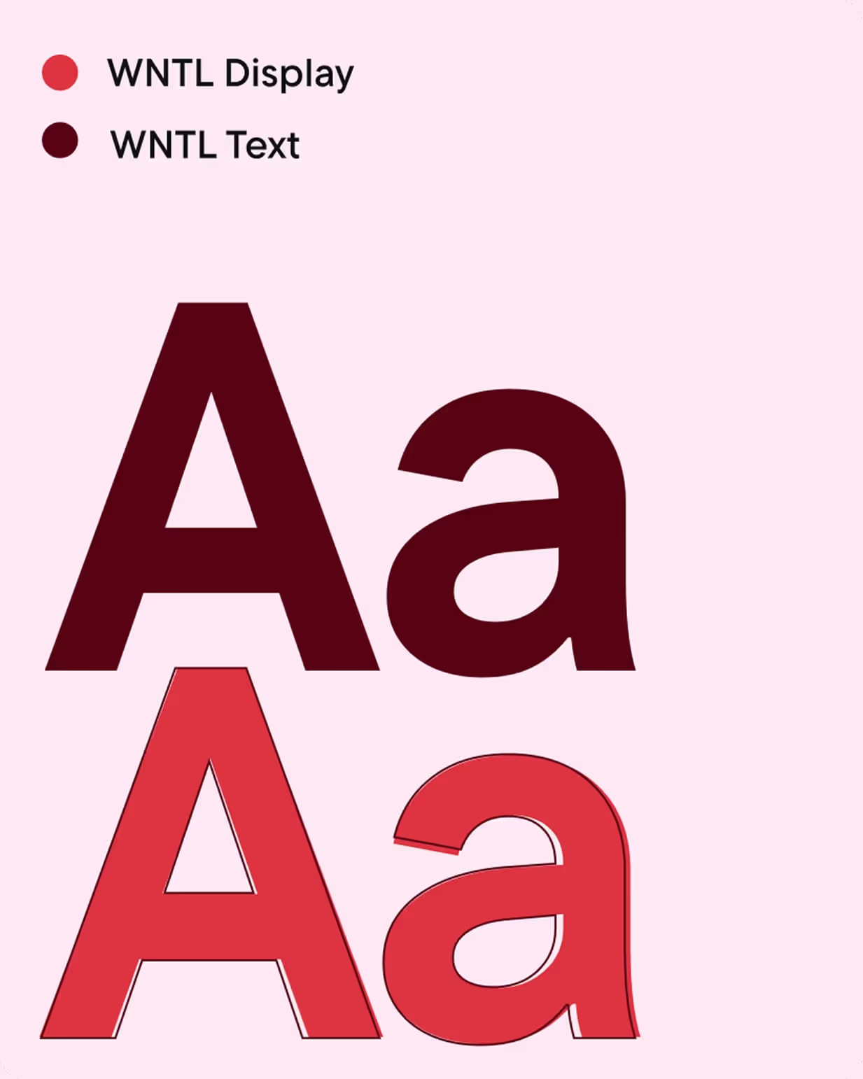
Digital to physical.
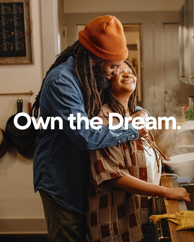
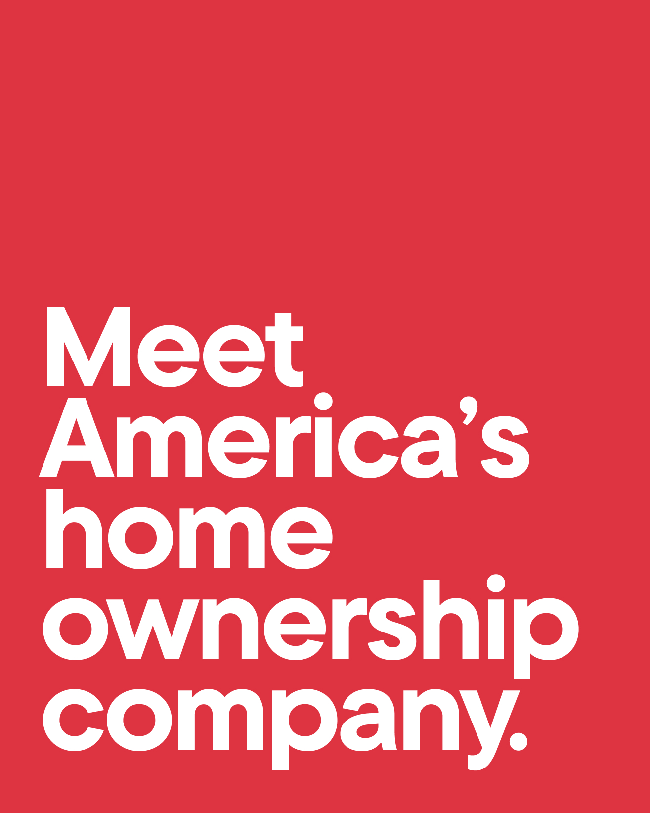
Built to perform from button to billboard and beyond. WNTL Display carries our voice, while WNTL Text ensures clarity wherever it appears.
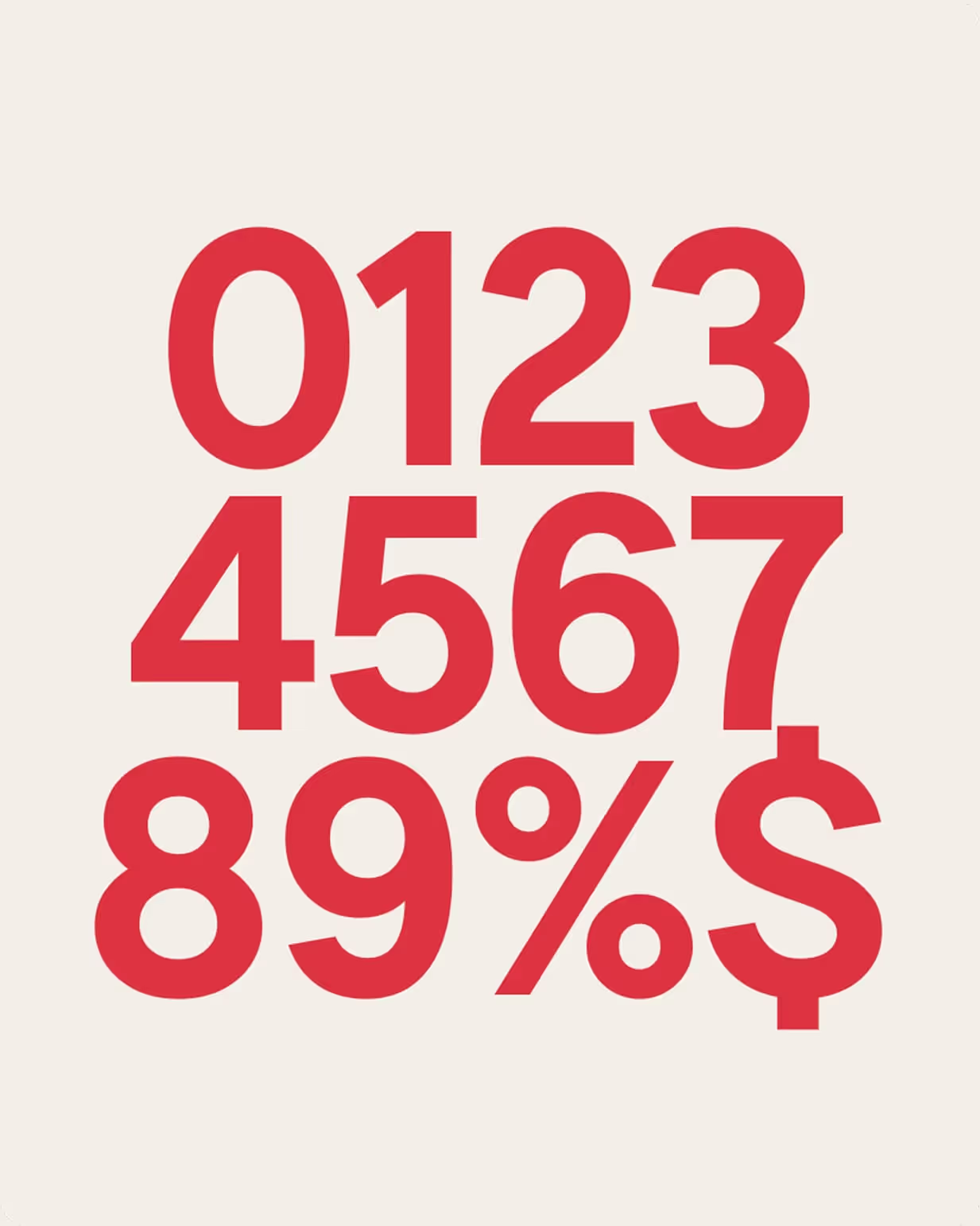
Trust in numbers.
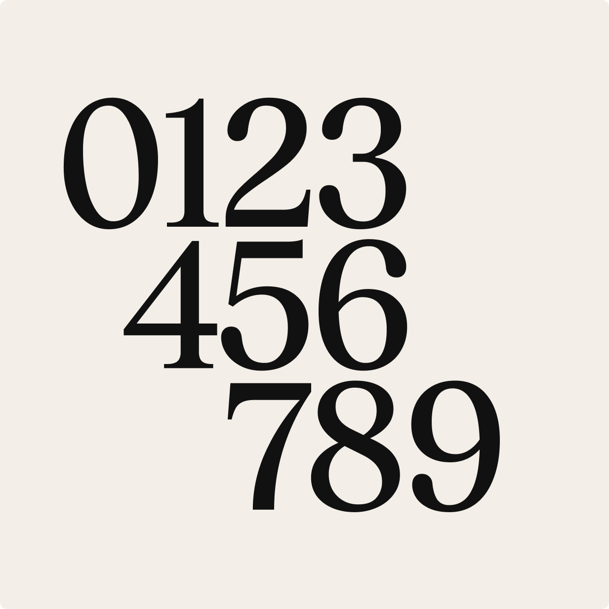
As a personal financial brand specializing in mortgages, we prioritize numerical clarity. Every figure is drawn with precision for simplicity, accessibility, and understanding.
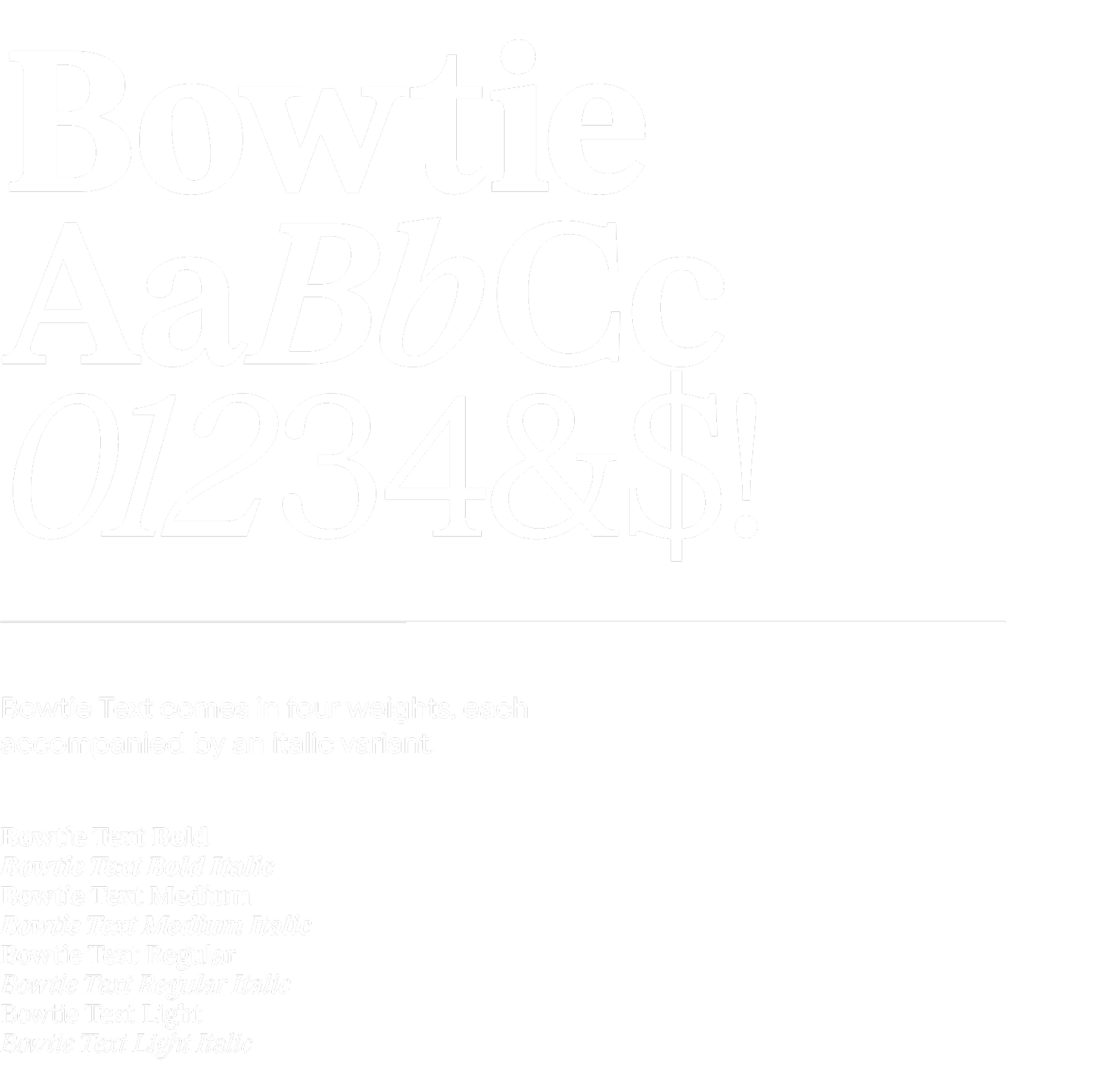
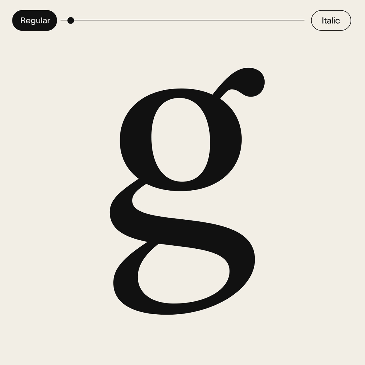
Our trusted, emotive, relatable serif designed with editorial elegance in mind.
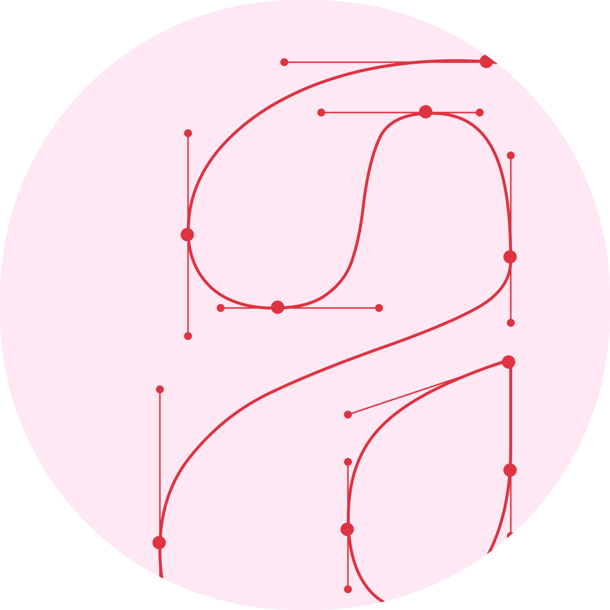
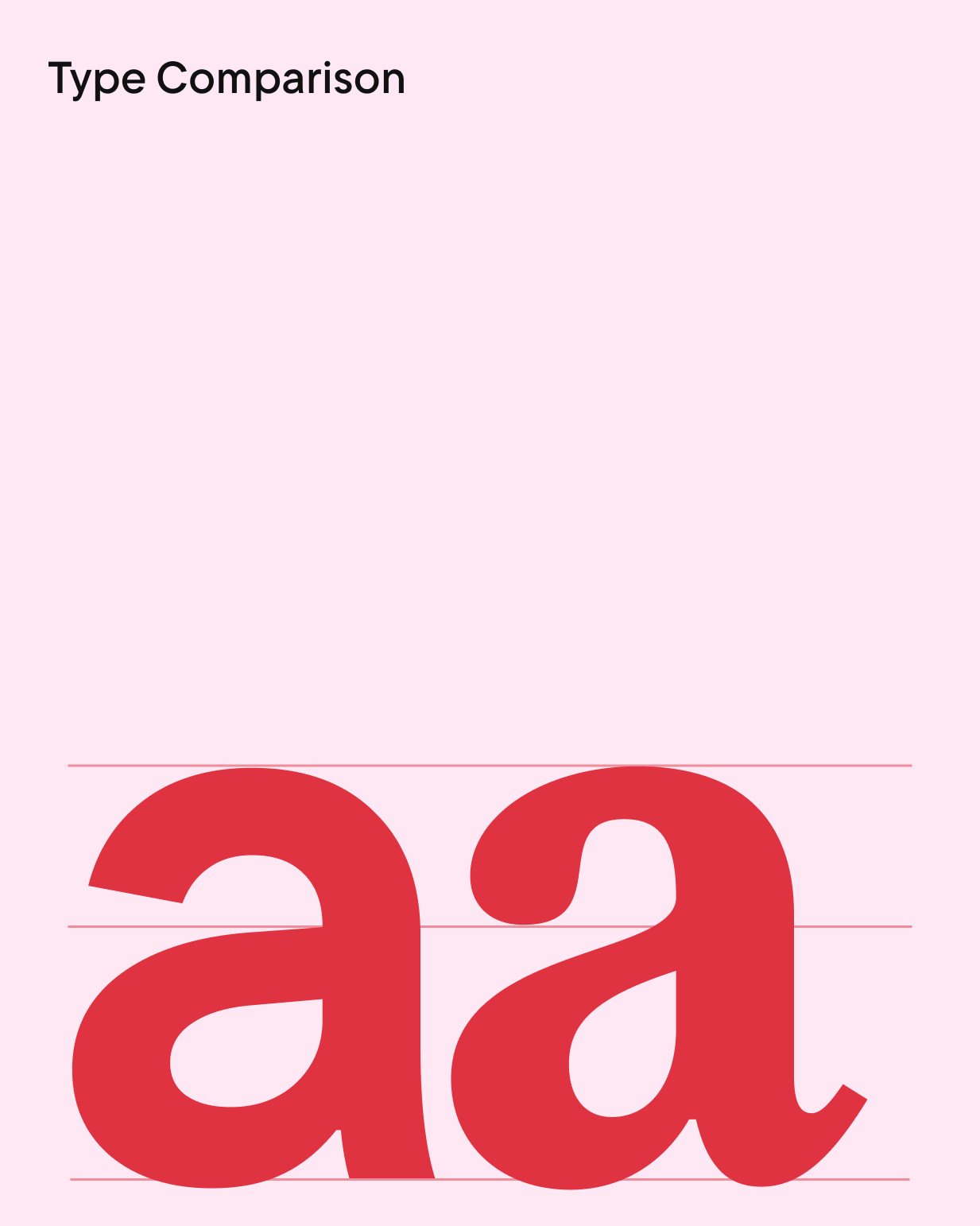
The perfect pair.
We matched the X height of each character to perfectly fit alongside our primary font, WNTL.
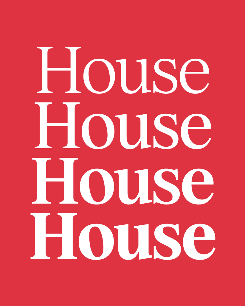
Designed for scale.
Four versatile weights create an elevated, scalable system that works consistently wherever we need it.
Together, they make a memorable combination.